UX Strategy
An end-to-end UX strategy and wireframe system for a science-led skincare brand — site architecture, navigation, and build-ready templates for every key page across desktop and mobile.

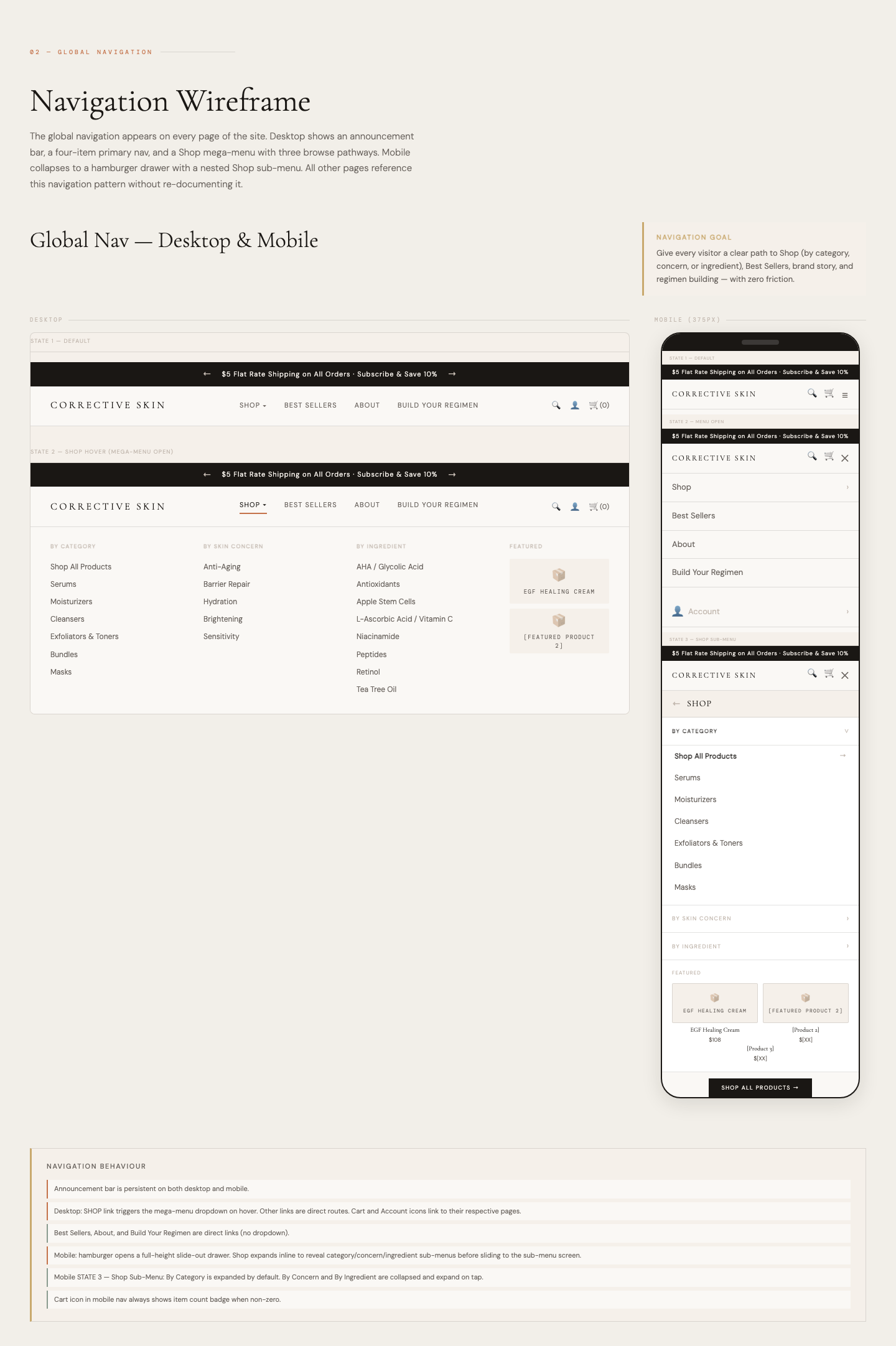
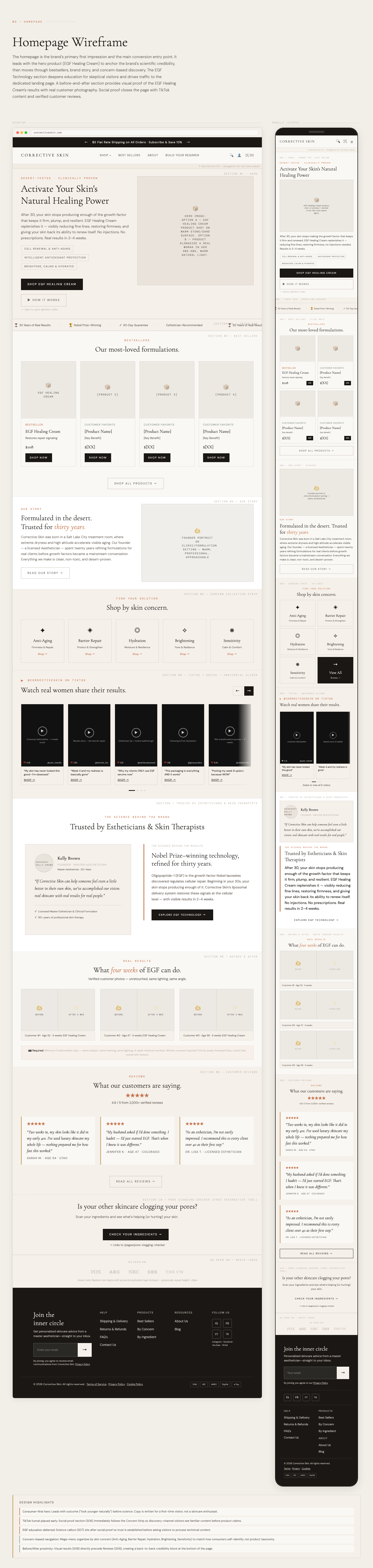
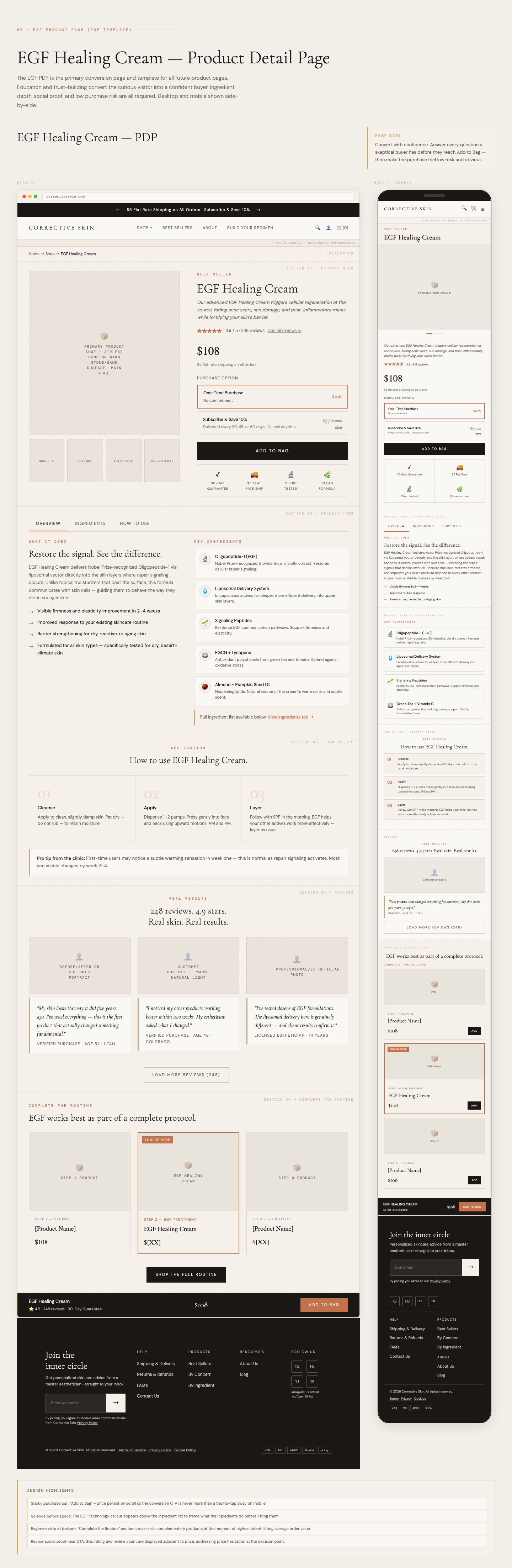
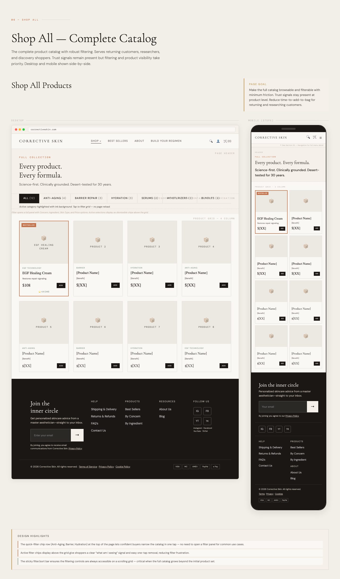
For Corrective Skin, I led the UX strategy and information architecture behind a full website redesign — translating a complex, science-led skincare range into a clear, intuitive path to purchase. Before any visual design, I defined the site map, navigation model, and user flows, mapping how customers move from discovery to product detail to checkout.
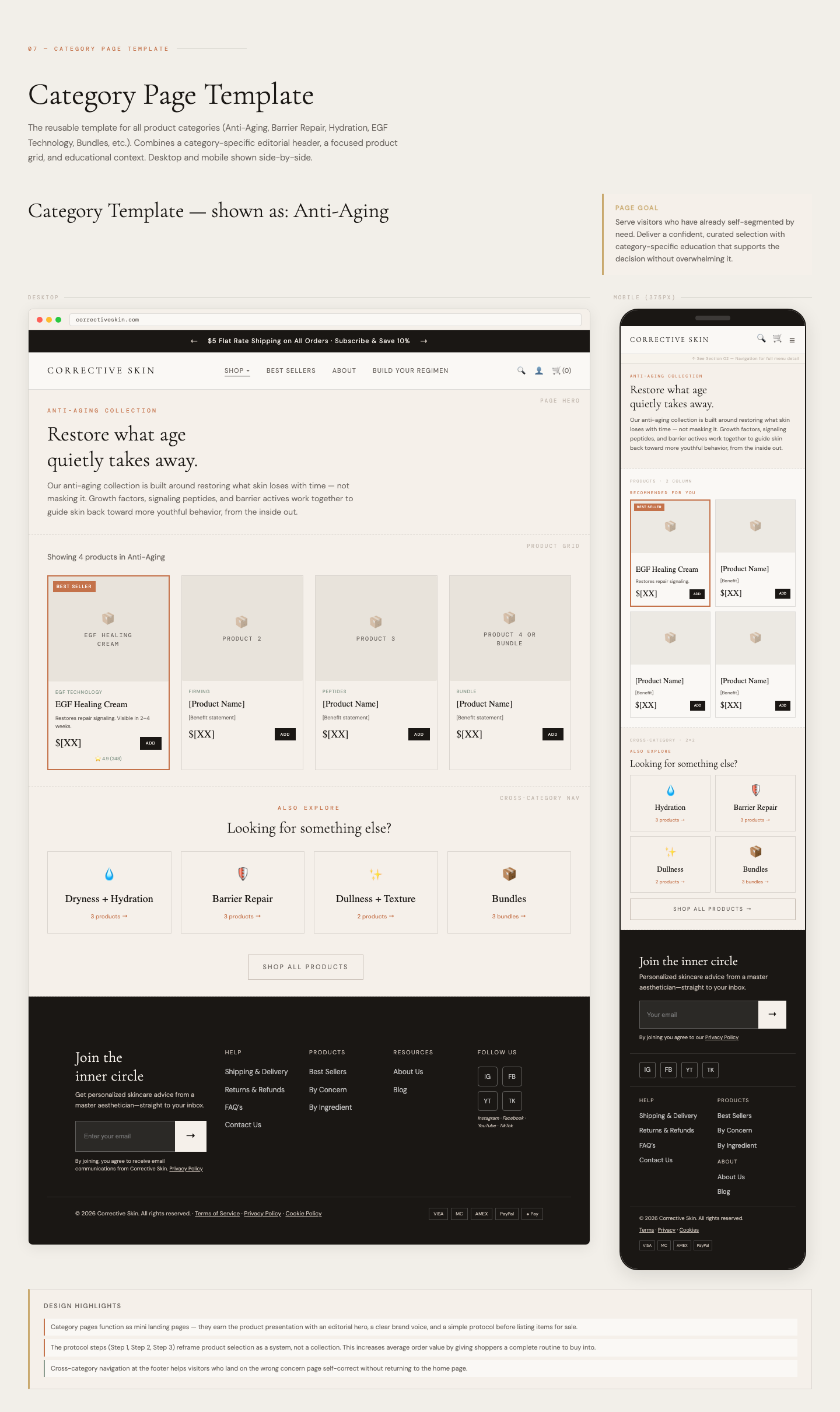
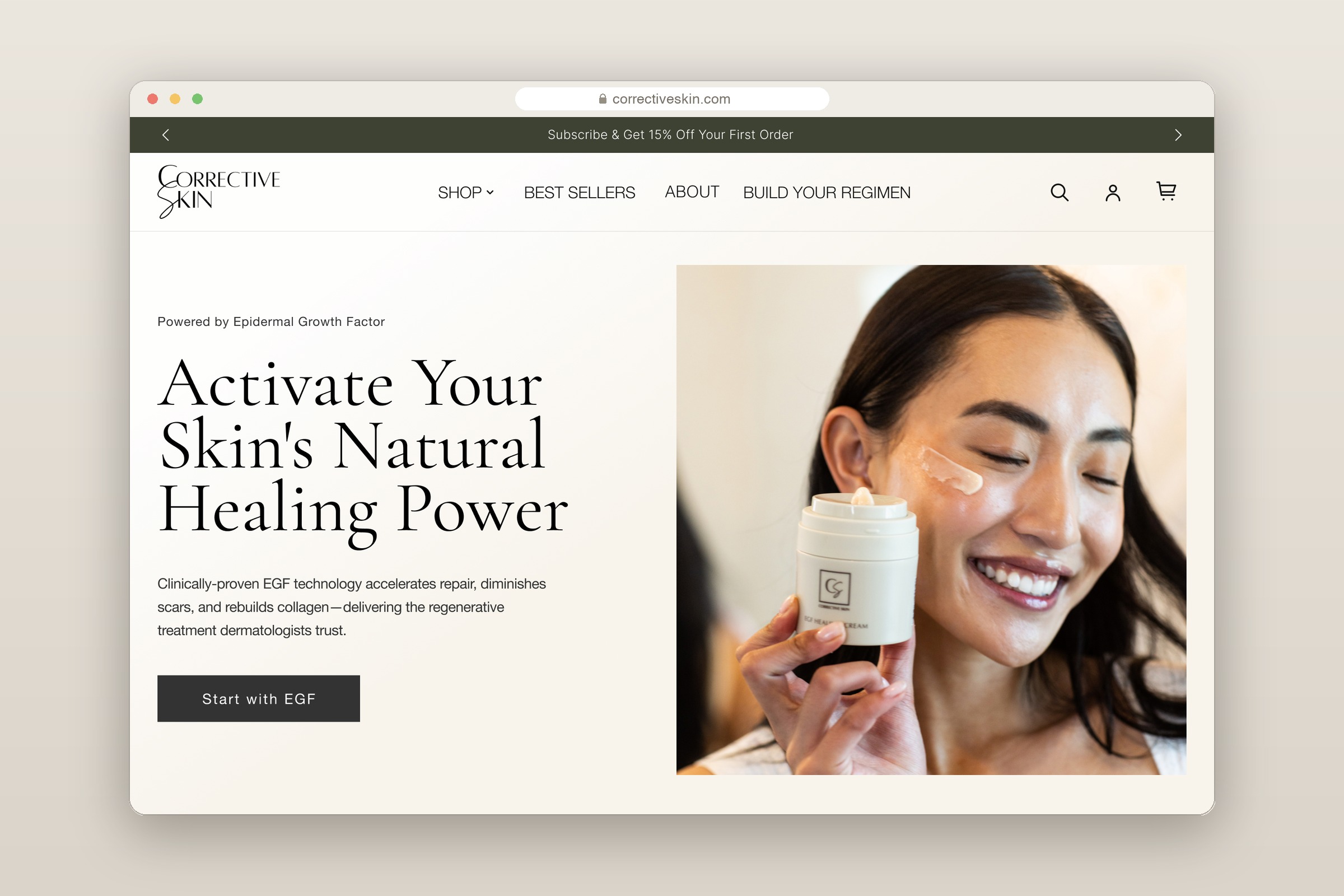
From that foundation I produced wireframes for all nine core page templates — homepage, EGF landing page, product detail, the full shop catalog, and the shop-by-concern and shop-by-ingredient pathways — across desktop and mobile. Each came with copy direction and a complete asset list, giving the team a build-ready blueprint grounded in real customer needs.
Key
Improvements
A strategic, research-driven approach that prioritized user needs while building a scalable foundation for future growth.
- •Defined the full site map and navigation model ahead of visual design
- •Mapped end-to-end user flows from discovery to product detail to purchase
- •Wireframed all 9 core page templates across desktop and mobile
- •Built multiple shopping pathways — by concern, by ingredient, and the full catalog
- •Structured science-led product information for clarity and confidence
- •Delivered copy direction and a complete asset list as a build-ready handoff
A central challenge was making a science-led, ingredient-heavy catalog feel approachable. The architecture introduced several ways in — shop by concern, by ingredient, or browse the full range — so customers could navigate using the language that fit their needs, reducing decision fatigue and building confidence on the path to purchase.